Latest News Links and more
From the Desk of the TPA Editor
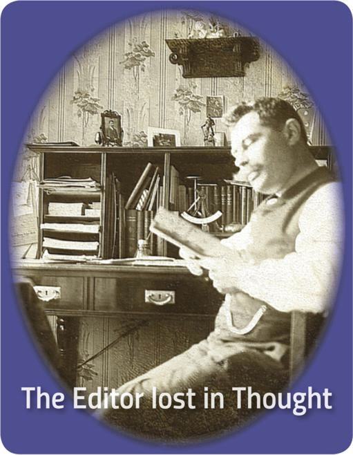
Hope you enjoy the new TPA web site and have discovered something of interest or new to you.
There is surely something which needs to be improved and/or corrected. I am still learning. Amateur in this field anyway.
The first attempt to lauch this site failed. Despite running fine on local server. Files for remote web server suddenly showed various error codes. In the end I had to built up all a second time. Frustrating.
If you wish to use any information and especially illustrations from this site for own use, why not ask in advantage?
I do have all the originals = better quality. Might have also additional details on particular topics and old ppc companies available.
Thank you.
Helmfried Luers/TPA
editor@tpa-project.info
The next TPA Issue
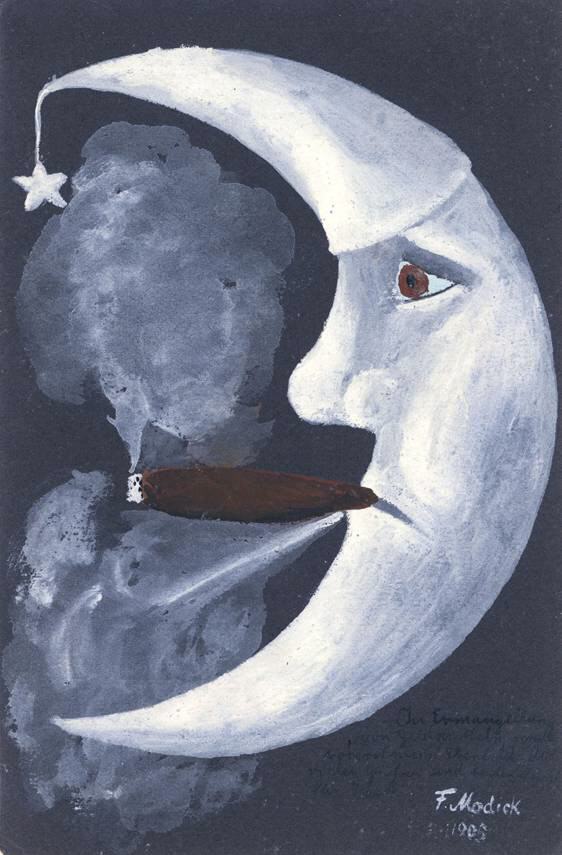
Had begun to work on content of TPA issue 36, but put it aside to concentrate on this new TPA web site. Despite being retired, there is never sufficient time as I learned.
Anyway, it is going to become another 80 pages magazine. Depends also on promised contributions by others still pending. These will be announced when at hands finally.
Some major topics of the coming TPA 36 are:
J. Miesler, Berlin: More background information and company data from better times before the company headed for the breakdown. A follow-up to last issues‘ "The End of J. Miesler".
M. Glueckstadt & Muenden, Hamburg: This early postcard publisher (and printers for some years? jobber?) always described to had been active mainly in the northern regions of Germany, was much more internationally as many may have expected. The card output of this business was impressive indeed. Taking a closer look at one of the German printers G&M ordered postcards from.
Edgar Schmidt, Dresden: There were a number of persons active in postcard business back then which turned out to had been a little bit untypical to dubious. Set up businesses, became big players, then disappeared/went broke etc. only to return again suddenly. Some of these characters were topics in previous TPA issues already. Now we take a look at Edgar Schmidt, source of numerous card issues of all types/makes. But did you know that there had been TWO E.S.D. companies in operation at the same time?
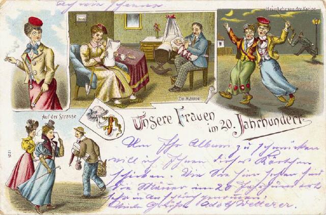
Other topics in the pipeline are
– "Music on Postcards"
– Aviation postcards of the 1960‘s
– Handcoloured/handmade cards from 1900-1960
– Research Updates
– Little-known German Postcard Printers
and more.
Depends on amount and quality of information at hand. Last minute changes possible. Everything can happen. You never know whch find comes your way the next day.
Table of final TPA 36 topics published when order is placed with printer.
Paragraph Marker (§) Trademark
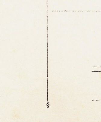
Sometimes names or mostly initials found imprinted on address sides of real photo cards are mistaken to stand for a photographer/photo studio or even a publisher. Actually this identifies the photo card to comes from a certain photo paper manufacturer and sometimes stood also for a particular paper quality.
Photo paper factories delivered packages containing 50, more more likely packs with 100 cards to the photo trade. Ready to use with pre-printed address side. They were used by professional photographers but also by amateurs. Photographers often added own imprints. There was a huge variety of different photo paper qualities in postcard size on offer.
The manufacturer initials/trade names were usually arranged below the dividing line. A good example are the initials "WW", "WM" etc. which stood for Dresdner Photochemische Werke Fritz Weber from Heidenau-Dresden.
Already some time ago I was asked by an US collector if I would know what the "§" would mean he had found on two old real photo cards. I did not know then. Now I found the answer who stood behind the paragraph marker by chance. "§" together with part of the dividing line was a protected trademark for "Rheinische Emulsions-Papier-Fabrik A.G." from Dresden. Registered on 12 July 1913, under class 6 and especially for picture postcards and photosensitive cards.
Should be helpful for approx. dating when not postally used. Most samples I have showing the "§" were clearly the work of amateur photographers.
Links of sites I have found useful entertaining
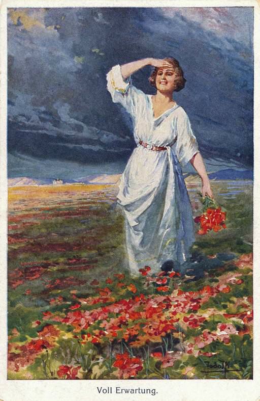
Vintage Thematic Postcards – various real photo card publishers, plenty to view.
Ross Verlag Movie Star Postcards I am sure the many Ross photo card series do not need a special introduction. See for yourself!
Picture Postcard Archives. Big site, academic standards. Run by Osnabrueck University.
Postcard Printer & Publishers. Very useful site, plenty to read and learn.
European Filmstar Postcards. Another big site with lots of background information on this collecting topic.
Publishers‘ Initials Identified. Miscellanea Deltiologia. Check out!
Postcards by the artist Michael Zeno Diemer (1867-1939). Detailed story including publishers involved.
Reflections of a Bygone Age. With access to the free online version of Picture Postcard Magic publication.
The Toronto Postcard Club. With various background information on Canadian Postcard Companies.
The Dutch Postcard Society VDP (Vereniging Documentatie Prentbriefkaarten) site is always worth a visit.
Neue Photographische Gesellschaft, Berlin-Steglitz. Although quite old meanwhile it is still online and presents all the basic NPG company (1897-1921) data and some good illustrations.
Library postcards from worldwide. Including historical information, blog etc. A little bit special, but well done.
Deutschsuedwester. Site for fans of Namibia/former German Southwest Africa Colony. Under the heading „Ansichtskartenarchiv„ you find former publishers/printers and plenty of old cards from that part of the world. The site covers also postal and railroad history.
Atlantic Cable. Bill Burns runs a site on old international communication cables connecting continents. The link leads you to a page with a specialised ship once used to lay cables. The card was published in TPA long ago. An unusual topic, but why not? Old picture postcards do cover really many topics, including some unexpected.
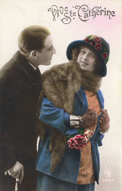
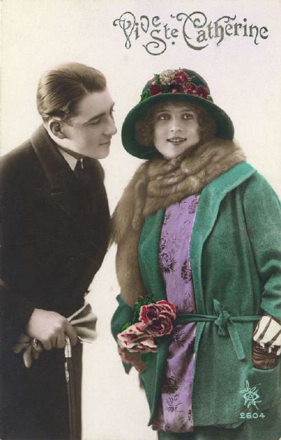
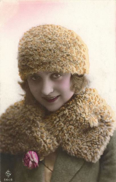
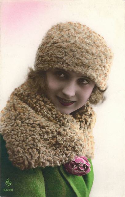
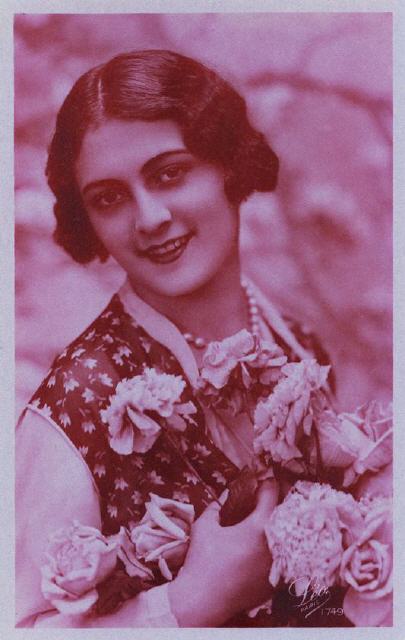
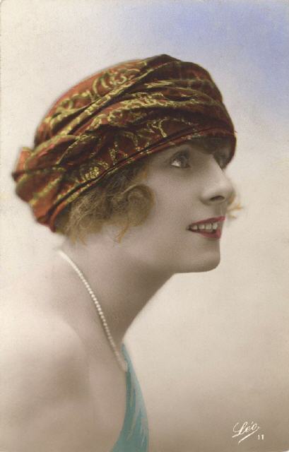
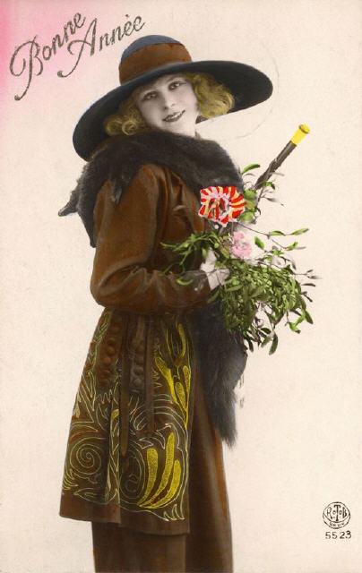
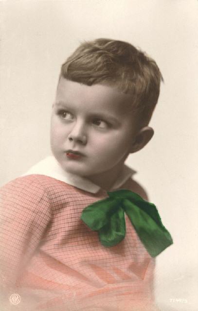
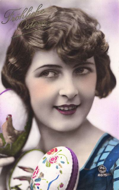
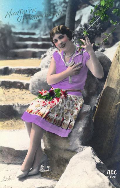
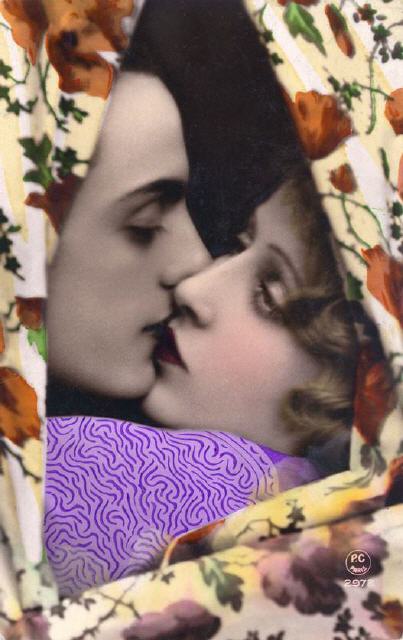
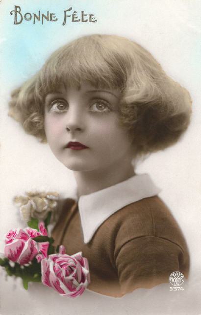
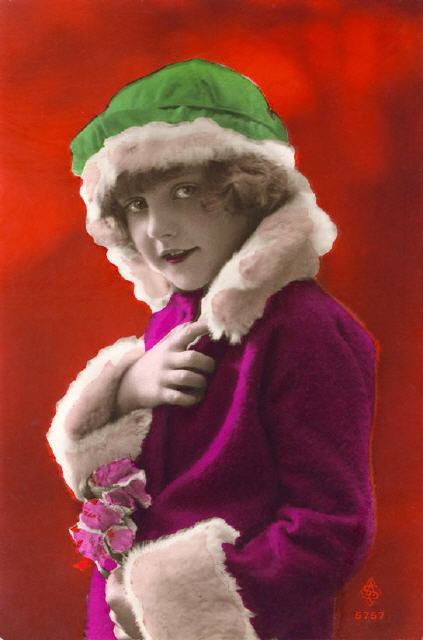
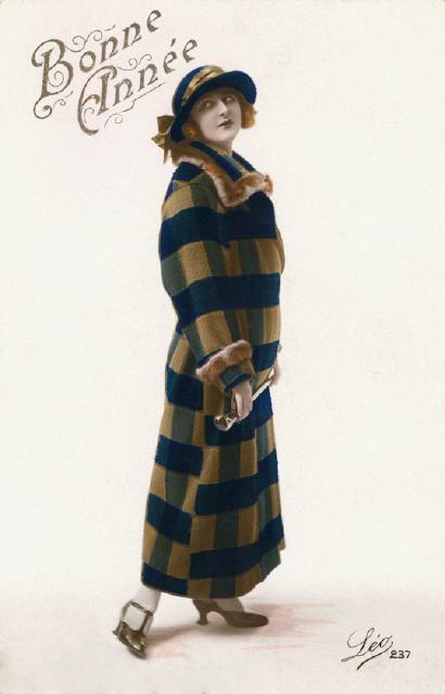
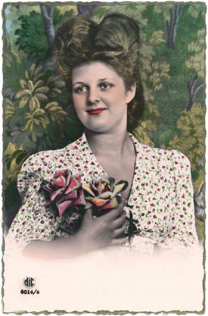
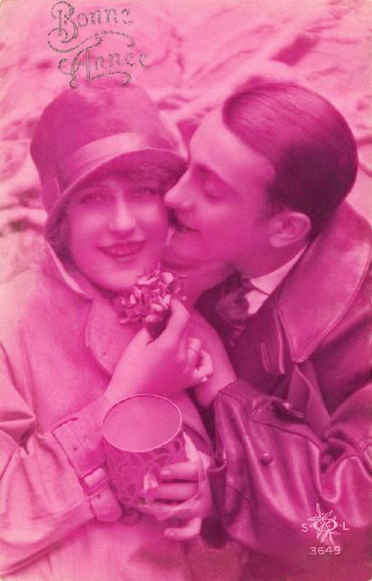
Colouring photo postcards French cards selection
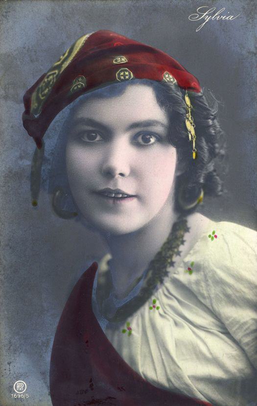
Adding colours to any monochrome prints (books, art sheets) manually was common for centuries.
Not surprising that when photography was used more and more for postcard production, people were quick to use hand-/stencil-colouring in order to turn monochrome views into something more attractive. Colours added produce more contrast and depth for the human eye, highlight particular portions or details of the view. But, it requires some skill and routine. Most of all you needed suitable colours, but many used (red for instance)during the early years were (semi-) opaque and covered image details.
Handcolouring with or without use of stencils was often used for collotype printed cards. When bromide real photo cards began to flood the markets, publisher were quick to add colours manually. However, the smooth surface of photo cards not really suitable for many colours then used. Some colours came out too "heavy", darkened portions of the image. Better grade coloured varnish colours first too costly for mass production. Later quick drying on smooth surfaces (protein) varnish colours were the perfect tool. Even when used in several layers. Of course you still needed skilled staff for quality results. The majority of better done coloured real photo cards dates from the 1920‘s.
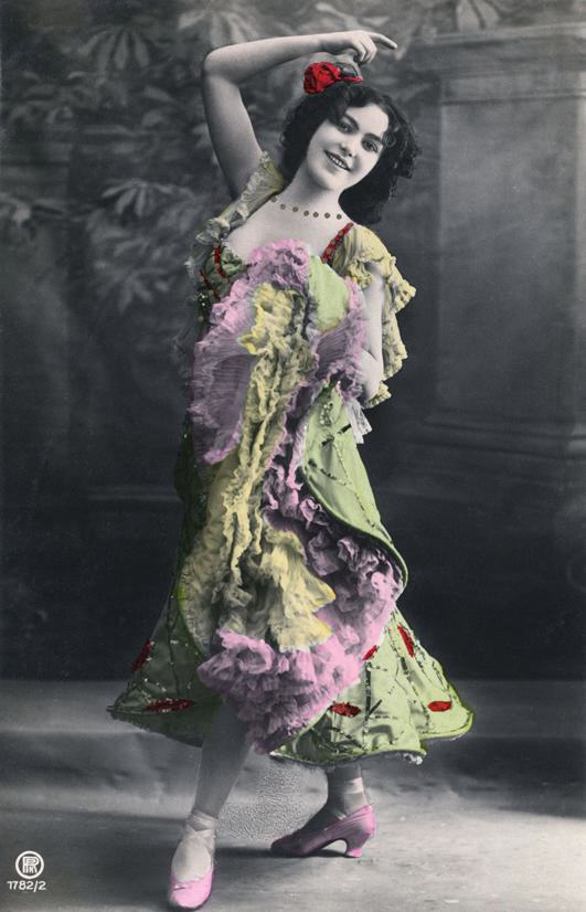
Another way to give photo postcards a „colour look„ was tinting the entire card during developing process. Particular chemicals/minerals were used for more or less good results and effects.
For manual colouring fine brushes, cotton wool and soft cloth were standard tools. Sometimes even airbrush techniques were used for soft colour effects. Although the latter was more common in the fancy paper/greeting card production.
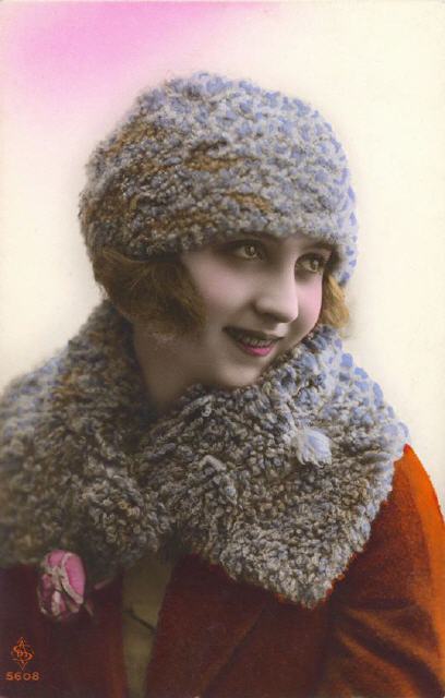
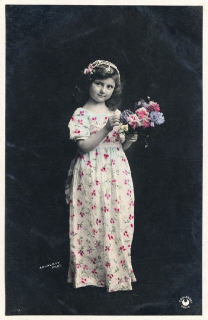
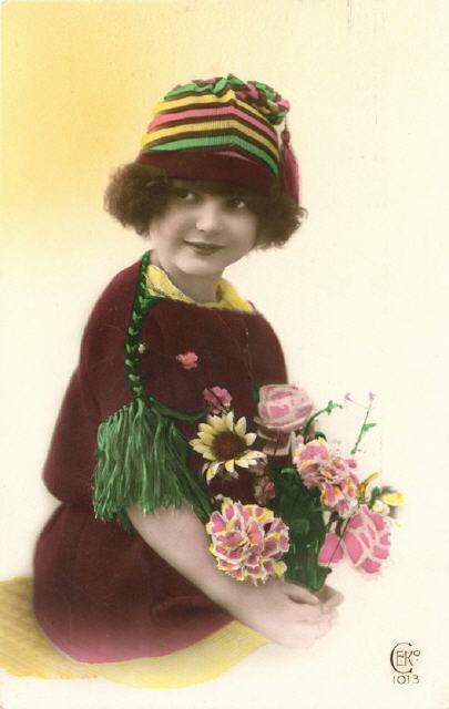
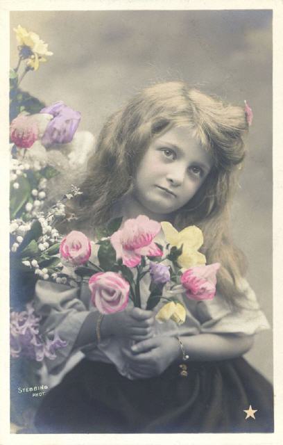
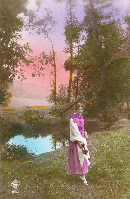
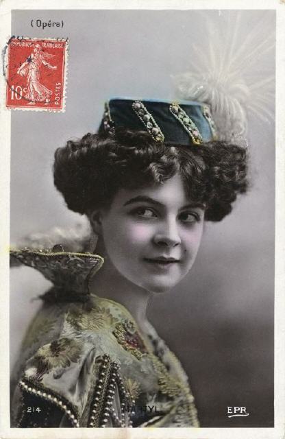
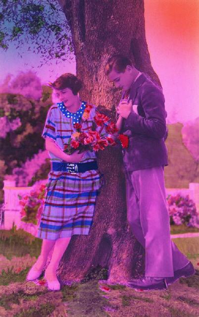
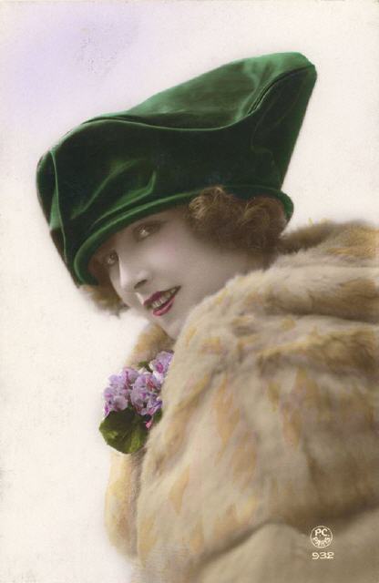
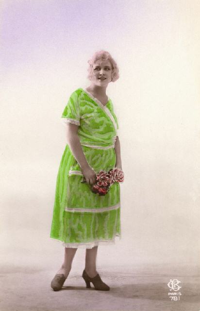
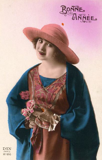
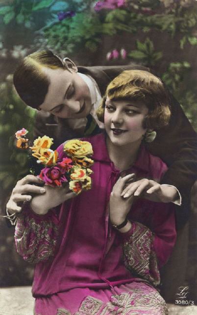
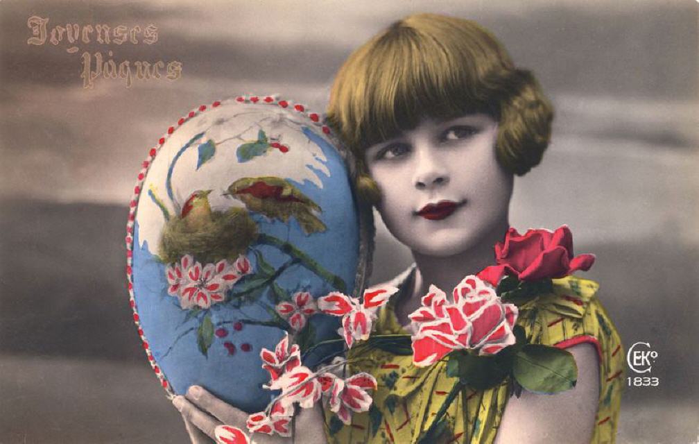
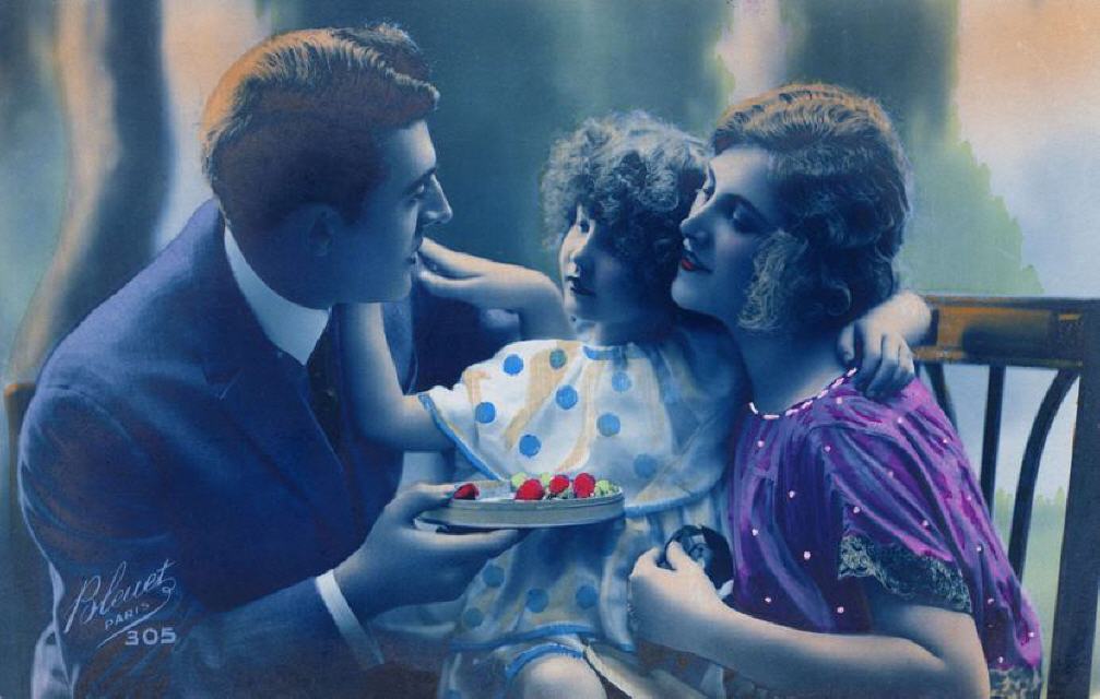
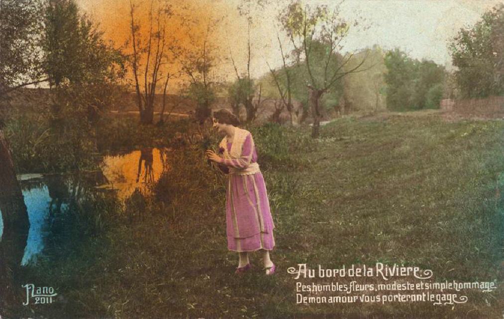
Especially French postcard trade companies were big in coloured photo cards. Many samples of various designs (coloured details/portions or fully coloured views) and quality still around. Some imitating "colour photo after nature" almost perfectly, others leaving a mixed impression. Another group with drastic to shocking colour effects likely to gain attention.
By the way, colouring was sometimes done very individually. Even within the same series where the same element (say a coat) shows a different colour from card to card. See first five postcard samples in selection shown below.
